Major League Soccer Team Crest Rankings
My opinionated rankings of Major League Soccer team crests and logos.I've been an at-times a practicing and professional designer now for some 20 years. I've also been a supporter of the Loons MLS football club since moving to Minnesota in 2017. This is an opinionated breakdown of the Major League Soccer team crests and logos, ranked from worst to best.
The world is far too serious right now. This is purely fun and not meant to offend. Don't like my list? Make your own and lemme know, but please do so with respect. I think more soccer is always better.
Table of Contents:
Methodology
I'll be using the follow criteria:
- Keep It Simple. The flag should be so simple that a child can draw it from memory.
- Use Meaningful Symbolism. The flag's images, colors, or patterns should relate to what it symbolizes.
- Use 2 or 3 Basic Colors. Limit the number of colors on the flag to three which contrast well and come from the standard color set.
- No Lettering or Seals. Never use writing of any kind or an organization's seal.
I borrow the above language from the Good Flag; Bad Flag, a fantastic resource from the vexillological community, which is the study of flags. During the MN State Flag redesign contest in 2023 I enjoyed geeking out on the process and results. Ties are broken using the squint test, which really rewards simplicity and contrast.
Squint Test
You cannot hide from this one. I find this to perhaps be the most important test, and my subjective tie-breaker. It's how you'll see a logo on a chyron, video game selection screens, embroidered on merch... just everywhere. It's how they are all presented on the footer of any MLS team site. The crest should be instantly recognizable, even at a small size, without a label.
All of them are hand-normalized to about 32 x 32px. The official sources I found had different aspect ratios and whitespace cropping, even some labeled 800x800.
Use your browser to zoom and and out.
Rankings
Okay, without further ado.
30. Colorado Rapids
| Metric | Value |
|---|---|
| KISS | 2 |
| Meaning | 2 |
| Colors | 2 |
| No Lettering | 1 |
Shield is narrow and smaller than most, even when upscaled manually. Soccer balls on crests feel like a generation or two ago. We've transcended that right? That was my rec team in the 90's. I like the colors, but the color variations that add depth just wash out when squinting. I like the mountain identity, but the small size really hurts. From the bottom, there are seven layers of color until you get to content. Overall too complicated.
29. Sporting Kansas City
| Metric | Value |
|---|---|
| KISS | 2 |
| Meaning | 1 |
| Colors | 3 |
| No Lettering | 1 |
I don't have much to say about this one. I don't know if a casual observer would know what the SC stands for. I can guess? But the lettering does not support the name even. Meaning is not intuitively clear. Poor squint test.
28. Houston Dynamo FC
| Metric | Value |
|---|---|
| KISS | 1 |
| Meaning | 3 |
| Colors | 3 |
| No Lettering | 1 |
I like the color contrast and the meaning behind the identity (canals), but it's far too complicated. If I am being true to the spirit of the vexillological criteria, it would be very hard to accurately draw. At small scale it all just gets washed out.
27. Atlanta United FC
| Metric | Value |
|---|---|
| KISS | 2 |
| Meaning | 2 |
| Colors | 2 |
| No Lettering | 2 |
This could be anything. If you don't catch some of the European inspiration in the stripes, it just fails to conjure much magic. The A stands apart, but the faux-realism of the letterform itself distracts and reduces contrast.
26. New York Red Bulls
| Metric | Value |
|---|---|
| KISS | 2 |
| Meaning | 1 |
| Colors | 3 |
| No Lettering | 2 |
It's a recognizable brand, but not a soccer team. I mean, all kits haver sponsors, but this is so engrained that it eclipsed the place, the people, what many try to say, the club. It also suffers from my low-bar soccer ball rule and only works with the text, else turning back into a drink.
25. San Jose Earthquakes
| Metric | Value |
|---|---|
| KISS | 2 |
| Meaning | 3 |
| Colors | 3 |
| No Lettering | 1 |
Some identity to the place, at least by exposition. Not great contrast. No clue what's under the Quakes lettering, even at a reasonable size. Soccer ball image docker it further points.
24. San Diego FC
| Metric | Value |
|---|---|
| KISS | 2 |
| Meaning | 3 |
| Colors | 1 |
| No Lettering | 3 |
I actually really like the San Diego crest. It works well large, and the identity connects.It sparks the flow of the ocean, the people, and the team at play. The major issue here is the use of color, which literally uses a gradient. Perhaps its too harsh to score it so low due to this, but all other crests are judged by the same criteria, and this one stands apart. We can debate if that's a good thing or not.
23. New England Revolution
| Metric | Value |
|---|---|
| KISS | 2 |
| Meaning | 2 |
| Colors | 3 |
| No Lettering | 2 |
Healthy contrast, but confusing imagery. There is a strike-through the R... do we not want revolution? One of the noticeable white crests among the league.
22. Charlotte FC
| Metric | Value |
|---|---|
| KISS | 2 |
| Meaning | 3 |
| Colors | 3 |
| No Lettering | 1 |
Great color, and reasonable identity speaking to the city's past. It effectively creates this illusion that you've seen this somewhere else. On a coin, on a token, somewhere. Unfortunately, a lot of lettering does not work well at small scales.
21. CF Montréal
| Metric | Value |
|---|---|
| KISS | 2 |
| Meaning | 3 |
| Colors | 3 |
| No Lettering | 1 |
This critique is similar to Charlottes, and they have the same score.
20. Toronto FC
| Metric | Value |
|---|---|
| KISS | 2 |
| Meaning | 2 |
| Colors | 2 |
| No Lettering | 3 |
I didn't know that was a maple leaf until I looked it up. This also reminds me a lot of Atlanta's crest, where the most we can muster is the first letter of the hometown.
19. Inter Miami CF
| Metric | Value |
|---|---|
| KISS | 1 |
| Meaning | 4 |
| Colors | 3 |
| No Lettering | 1 |
I mean this is the one everyone is looking for, right? Trying not to play any favorites here. But the crest itself is almost lost in its own cleverness. I don't think a child could draw this from memory, and it just was far too much lettering. The MLS store even offers some official hats that only use a subset.
18. Real Salt Lake
| Metric | Value |
|---|---|
| KISS | 2 |
| Meaning | 2 |
| Colors | 2 |
| No Lettering | 4 |
This is the highest soccer ball crest, and I really wavered on some of these middle-ranked teams. In the end we have the squint test to separate a reasonably even playing field. This is the first crest with no words at all. I don't give it much of a bump for identity, when by some accounts it had to ask Real Madrid for permission to use the name.
17. Philadelphia Union
| Metric | Value |
|---|---|
| KISS | 1 |
| Meaning | 4 |
| Colors | 4 |
| No Lettering | 1 |
I'm a fan, but I worry its got too much going on. It has a circle and a shield, which insets the snake into relegation. Good color, but heavy lettering, and as RSL just proved, we can in fact do without it.
16. New York City FC
| Metric | Value |
|---|---|
| KISS | 2 |
| Meaning | 4 |
| Colors | 3 |
| No Lettering | 2 |
Mmmmmmm. Okay, this is a nerd snipe, but I am still impartial (I think!). Heavy use of lettering, but a custom typeface literally contracted by Tobias Frere-Jones of Gotham and Interstate fame. The letterforms have evocative connections to other NYC teams, but that very intertwined nature makes it hard to reproduce faithfully. Small formats suffer.
15. Vancouver Whitecaps FC
| Metric | Value |
|---|---|
| KISS | 3 |
| Meaning | 3 |
| Colors | 3 |
| No Lettering | 2 |
In the middle of the pack here, we gotta get picky to differentiate. I like the color, I like the meaning and simplicity, but the heavy use of lettering here is noticeable large, and impossible when smaller.
14. LA Galaxy
| Metric | Value |
|---|---|
| KISS | 3 |
| Meaning | 3 |
| Colors | 3 |
| No Lettering | 2 |
We can enjoy some simplicity here. The quasar roots the team in the early community. The letterform here is already an acronym, and doesn't need to say more. LAFC makes even better use of this, in my opinion. Simple to draw, high contrast, and stands out when small.
13. FC Dallas
| Metric | Value |
|---|---|
| KISS | 3 |
| Meaning | 3 |
| Colors | 4 |
| No Lettering | 2 |
Gosh did I struggle with some of these animal-based crests. To draw this true to form, you need to really understand the use of color here to create depth. It's a striking identity. In the end, I gave all animal crests a bit of a benefit of the doubt - a kids doesn't need the same number of feathers in order to draw a bird. A bull here has the same logic, in theory.
12. FC Cincinnati
| Metric | Value |
|---|---|
| KISS | 2 |
| Meaning | 4 |
| Colors | 4 |
| No Lettering | 3 |
There's another log jam of stellar crests starting here. This is 2 of 4 in a row that are animals. The winged lion connects to the heritage of the city, and the colors are superb. Especially the orange. Not a lot to fault, except perhaps the lettering, which is in the middling usage comparatively. The wide shield helps on smaller scales, but the lion loses a lot of definition and the finer details might be hard to replicate.
11. D.C. United
| Metric | Value |
|---|---|
| KISS | 2 |
| Meaning | 4 |
| Colors | 4 |
| No Lettering | 4 |
Here again with the animals. I feel like this might be harder to draw than FC Cincinnati - but golly it's close. DC has some pretty obvious markers to the nation's founding and the eagle. This is clearer than New England. If I had to do this again, perhaps I'd ding it for being a bit cliché in execution. A stereotype identity.
10. Minnesota United FC
| Metric | Value |
|---|---|
| KISS | 3 |
| Meaning | 4 |
| Colors | 3 |
| No Lettering | 4 |
A notable crest, like Vancouver or Columbus, in that it forges its own shape. No shield or circle to formulate an identity (battle, community). Instead, MNUFC leans into the state bird, the loon, and limits lettering to an afterthought. Those pesky hard-to-draw animal feathers are the major downside. And my internal rubric about color - even though red is limited here, and important, it does add to the palette.
9. St. Louis City SC
| Metric | Value |
|---|---|
| KISS | 3 |
| Meaning | 4 |
| Colors | 4 |
| No Lettering | 3 |
Next level crests center their identity in place, but do so showing, not telling. A simple color scheme with high contrast excels here, and the reference to the Gateway Arch and rivers is exceptional. The lettering and potential complexity is the only downfall here. From a squint you can can see City... but there are lots of those aren't there?
8. Austin FC
| Metric | Value |
|---|---|
| KISS | 3 |
| Meaning | 4 |
| Colors | 4 |
| No Lettering | 3 |
A virtual tie with St. Louis, and for all the same reasons. The verdant green sticks out among the rest.
7. Orlando City SC
| Metric | Value |
|---|---|
| KISS | 3 |
| Meaning | 3 |
| Colors | 5 |
| No Lettering | 3 |
We hit our first 5. Orlando's crest can pass for duotone. I didn't even know it was using white til writing this. Again, the animal identity makes for potentially difficult sketching, but its history and inner-meanings are nice. Lettering is typical of many crests.
6. Los Angeles FC (LAFC)
| Metric | Value |
|---|---|
| KISS | 3 |
| Meaning | 4 |
| Colors | 5 |
| No Lettering | 3 |
Really leaning into an art-deco aesthetic, LAFC's crest is a great example of how to use a letterform as an identity. The smaller words could be removed without much detriment. The gold and black work.
5. Nashville SC
| Metric | Value |
|---|---|
| KISS | 4 |
| Meaning | 3 |
| Colors | 5 |
| No Lettering | 3 |
Two darkhorses are coming up!
Nashville eeks into the top 5 with a simple but effective crest. The color starkness really works, even if the contrast is used to define the location as always. The subtle soundwaves and odd shape give us something to think about.
4. Columbus Crew
| Metric | Value |
|---|---|
| KISS | 4 |
| Meaning | 3 |
| Colors | 4 |
| No Lettering | 5 |
Now this is bold! Love the purposeful shape to the home state flag. Again, the stark contrasting colors and singularly focused C leave little else to question. Should this perhaps not get a 5 for lettering? I don't know. The floating name actually melts away completely to me .
3. Portland Timbers
| Metric | Value |
|---|---|
| KISS | 5 |
| Meaning | 3 |
| Colors | 4 |
| No Lettering | 5 |
The top three crests in MLS are not messing around. Portland's proves this with a singular axe. It evokes the Pacific Northwest, the timber industry, and the team itself. Anyone could draw this. No words, no letters, no numbers. A simple masterpiece.
2. Chicago Fire FC
| Metric | Value |
|---|---|
| KISS | 4 |
| Meaning | 4 |
| Colors | 4 |
| No Lettering | 5 |
Yes. YES. Chicago's crest respects its community, advocating for its home and building upon it. It also says fire without saying "fire". Yeah, there's a big C, like Columbus, but both get high marks.
1. Seattle Sounders FC
| Metric | Value |
|---|---|
| KISS | 4 |
| Meaning | 5 |
| Colors | 5 |
| No Lettering | 5 |
Simply, nearly, perfect. It's hard to argue this isn't instantly recognizable. This is a minimalistic, stark homage to the club's home. It's a symbol of something more. The colors are vibrant and have enough negative space to stand proudly. Of all the crests, this is the only one that prominently displays its year of founding, even beyond that of its name.
Table
Here's all of them again, but in a more comparative format.
| Rank | Crest | Team | Score | KISS | Meaning | Colors | No Lettering |
|---|---|---|---|---|---|---|---|
| 30 | Colorado Rapids | 7 | 2 | 2 | 2 | 1 | |
| 29 | Sporting Kansas City | 7 | 2 | 1 | 3 | 1 | |
| 28 | Houston Dynamo FC | 8 | 1 | 3 | 3 | 1 | |
| 27 | Atlanta United FC | 8 | 2 | 2 | 2 | 2 | |
| 26 | New York Red Bulls | 8 | 2 | 1 | 3 | 2 | |
| 25 | San Jose Earthquakes | 9 | 2 | 3 | 3 | 1 | |
| 24 | San Diego FC | 9 | 2 | 3 | 1 | 3 | |
| 23 | New England Revolution | 9 | 2 | 2 | 3 | 2 | |
| 22 | Charlotte FC | 9 | 2 | 3 | 3 | 1 | |
| 21 | CF Montréal | 9 | 2 | 3 | 3 | 1 | |
| 20 | Toronto FC | 9 | 2 | 2 | 2 | 3 | |
| 19 | Inter Miami CF | 9 | 1 | 4 | 3 | 1 | |
| 18 | Real Salt Lake | 10 | 2 | 2 | 2 | 4 | |
| 17 | Philadelphia Union | 10 | 1 | 4 | 4 | 1 | |
| 16 | New York City FC | 11 | 2 | 4 | 3 | 2 | |
| 15 | Vancouver Whitecaps FC | 11 | 3 | 3 | 3 | 2 | |
| 14 | LA Galaxy | 11 | 3 | 3 | 3 | 2 | |
| 13 | FC Dallas | 12 | 3 | 3 | 4 | 2 | |
| 12 | FC Cincinnati | 13 | 2 | 4 | 4 | 3 | |
| 11 | D.C. United | 14 | 2 | 4 | 4 | 4 | |
| 10 | Minnesota United FC | 14 | 3 | 4 | 3 | 4 | |
| 9 | St. Louis City SC | 14 | 3 | 4 | 4 | 3 | |
| 8 | Austin FC | 14 | 3 | 4 | 4 | 3 | |
| 7 | Orlando City SC | 14 | 3 | 3 | 5 | 3 | |
| 6 | Los Angeles FC (LAFC) | 15 | 3 | 4 | 5 | 3 | |
| 5 | Nashville SC | 15 | 4 | 3 | 5 | 3 | |
| 4 | Columbus Crew | 16 | 4 | 3 | 4 | 5 | |
| 3 | Portland Timbers | 17 | 5 | 3 | 4 | 5 | |
| 2 | Chicago Fire FC | 17 | 4 | 4 | 4 | 5 | |
| 1 | Seattle Sounders FC | 19 | 4 | 5 | 5 | 5 |
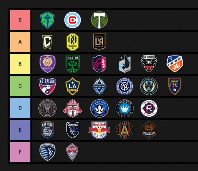
Tier List
This is what the kids do these days, right? I am pretty happy with a rough bell curve here, even if some of the stratifications break within tied scores.
Jack's Rankings
I asked Jack to rank his favorites. He just underwent surgery to repair a cyst in his femur. It cut short his Spring and Summer season. With luck and work, he'll be playing soccer again in Fall. In the meantime, we can enjoy the game from the sidelines and on TV.
I really enjoyed looking at the MLS crests through his eyes. He's even got a recognizable distribution here too. Sorry FC Cincinnati, I'm not sure what you did to him!